Android Developers Newsletter
User Research, Product design
Client: Google
Agency : Potato London
This is a UX and visual design case study for the Android Developers Platform Newsletter. The end goal of this work was to define all the possible ways so as to ameliorate the existing experience of the users with the Newsletter. Apart from that, to find out and establish the best design practices to attract more users and subscriptions.

Problem framing
The newsletter page of Android Developers platform receives only 5% of total landing page traffic.
➊ How might we increase Newsletter subscriptions?
➋ How might we bring more traffic to Newsletter and enhance discoverability?
Pain points
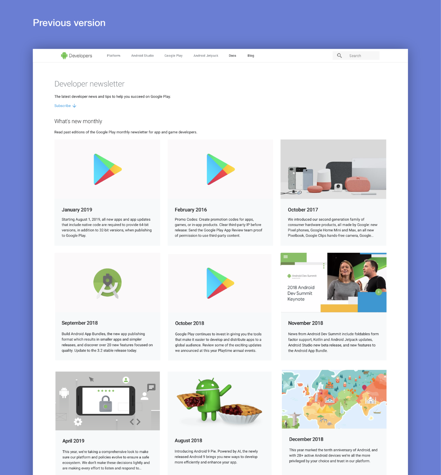
So we took a deeper look into this topic and tried to check some of the holes. Here is the current experience based on the navigation through the Newsletter pages, and the main experience issues that stem out of it:
1 News page
No CTA for the DAC newsletter page on top o the newsletter page. The only way to access the newsletter is from a button at the bottom of the page. That means that the user needs to scroll down through the entire page to find it.
2 Newsletter page
No direct Subscribe CTA on the Newsletter page. The subscribe button is subtle and leads only to the bottom of the page where the subscription form is, with a scroll down animation.
3 Subscription form
The newsletter form itself has a non prominent visually design, that is being missed easily from some users.
Research process
1. Hypothesis mapping process
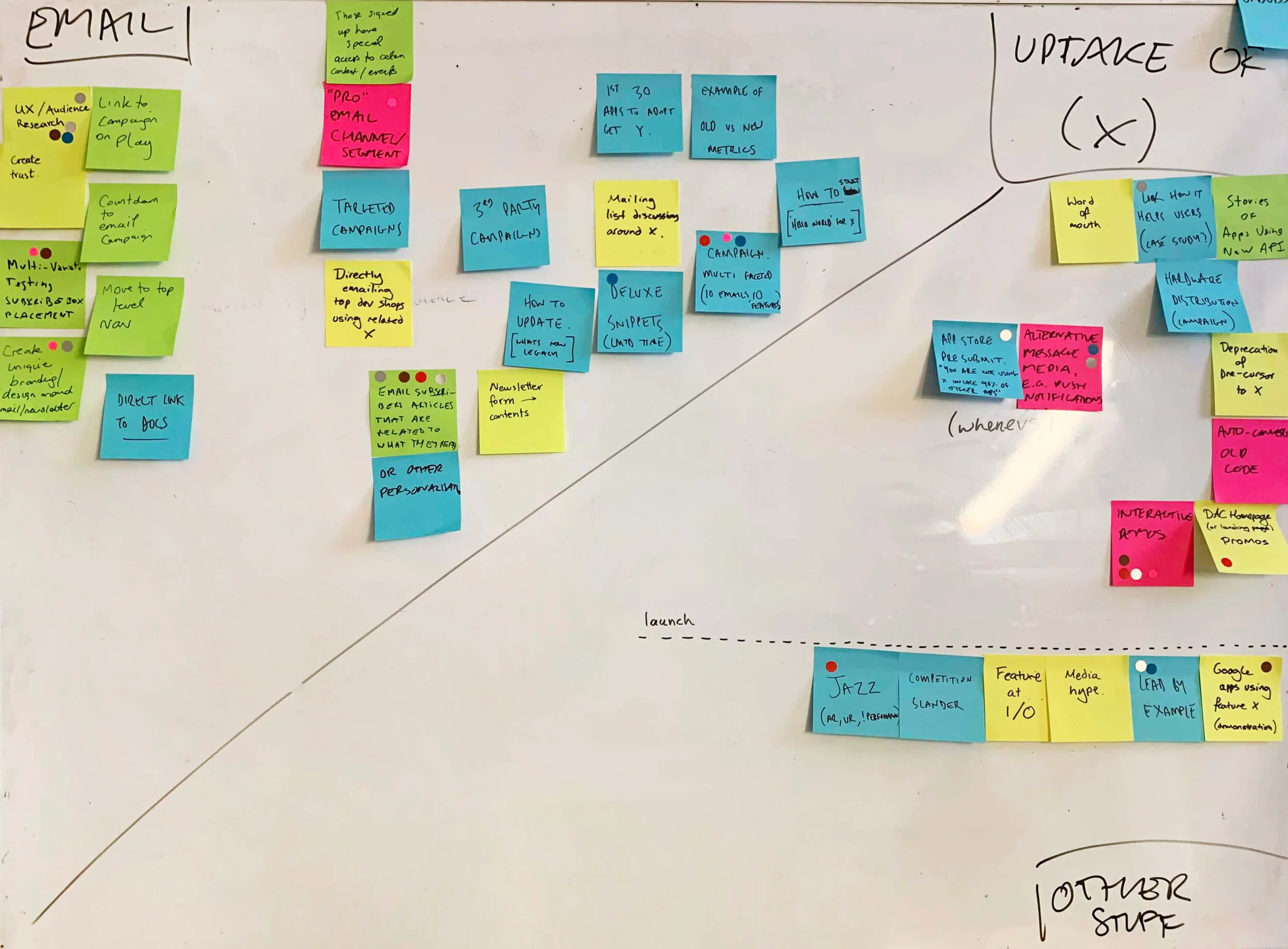
We started by running a big X-Functional workshop. We identified the opportunities and narrowed down the most prominent ideas based on the potential that each idea could have for the Newsletter traffic and the effort for Engineering implementation.
Some of the opportunities we defined:
Create trust to users
Relevant e-mail articles for the subscribers
Homepage promotional material through hero and featured cards
Implementation of engaging visual and illustrative assets
After the workshop I used some of the findings to align them with the fundamental vision of the Android Devs Marketing plan; create the world’s best developer platform. I used the golden circle rule involving our outcomes, our main purpose and the important in-between step; the processes we will follow.
2. User interviews and focus groups
In order to gain some insights I start observing how engineers navigate in DAC pages so as to subscribe to the newsletter. I also asked 35 engineers questions about newsletters, why they subscribe and what they like about them.
As an example of this research, this is the outcome of the question ‘In your opinion, what is the main reason that prevents a potential user from subscribing to a newsletter?’ :
3. Competitor analysis
As a part of the desk research, I also did a competitor analysis, collecting both the best examples and the go-to platforms of the interview participants.
Design solutions ✨
Opportunities and hypotheses
For the users that are
afraid of getting spammed
Assure the users of the newsletter reliability and block things they’re afraid of out (no snap messages, ease of unsubscription, security of personal information)
Simpler subscription form
Engaging and clear design of the subs
For the users that are
not aware of subscription
Obvious, noticeable call to action
Promotion go the newsletter throughout the page (promo cards)
Distinct call for subscription on the main Newsletter page
For the users that are
not interested enough
Reasons for subscribing and usage of compelling practices (eg. testimonials)
Make the news section appealing, correspond to every possible need (variety, featured user stories, discussion stories etc.)
Home page
⮕ solution: Add a newsletter featured card / CTA since it will:
be a distinct call to an engaging call to action right after the hero section
inform users about the DAC newsletter
offer the ability to sign up directly via e-mail subscription on the main Newsletter page
Newsletter page
⮕ solution: More prominent hero and CTA
placement in an apparent location on the page
easy and straightforward
more engaging, playful UI
direct Sign-up button, instead of the previous scroll-to-bottom CTA which led the user to a subscription form at the bottom of the page
provides reasons / motivates to subscribe (eg. no spam)


Subscription form
⮕ solution : Separated Newsletter page and simpler content
Standalone page, open-in-new-tab page
Not too many personal details or complex (as this could disengage a potential user from subscribing)
Clean design for better navigation
Avoid unambiguous questions


Key learnings
➊ Increased traffic and discoverability
Taking into account the new addition of a Newsletter card into the home page, the redesign and the updated UXW, we managed to increase traffic to Newsletter by almost 50% 🎉
➋ Increased Newsletter subscriptions
Users ignoring Call to Actions has been a known pain point across DAC, especially before the release of the new redesign. By redesigning and then adding a bold and prominent Subscription page, using revamped UXW that assures the users of the newsletter reliability, giving prominence to CTAs, we managed to increase subscriptions by almost 20%, comparing to the subscriptions rate before the redesign.
➌ Trust with simplified content
We learned from research that users valued a clean and simple interface that allowed them to find content quickly without unnecessary complexity so we designed and keep the UI minimalistic and focused on clear, intuitive navigation paths.


