Cubitts
Product design
Client: Cubitts
Collaborators: Tina Touli
Year: 2019
Cubitts, established in 2012, is an eyeglass manufacturer based in Kings Cross, London, England.
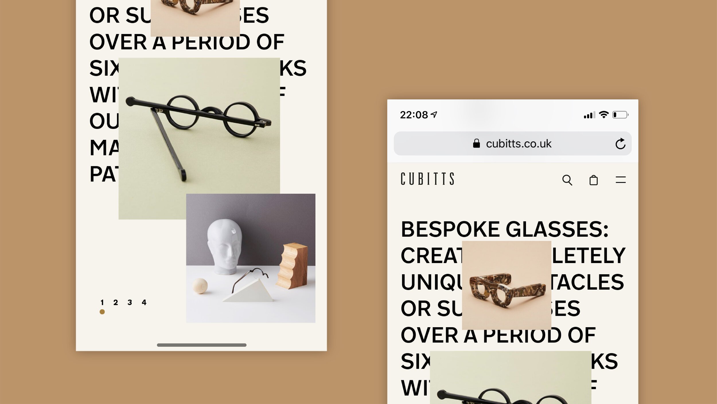
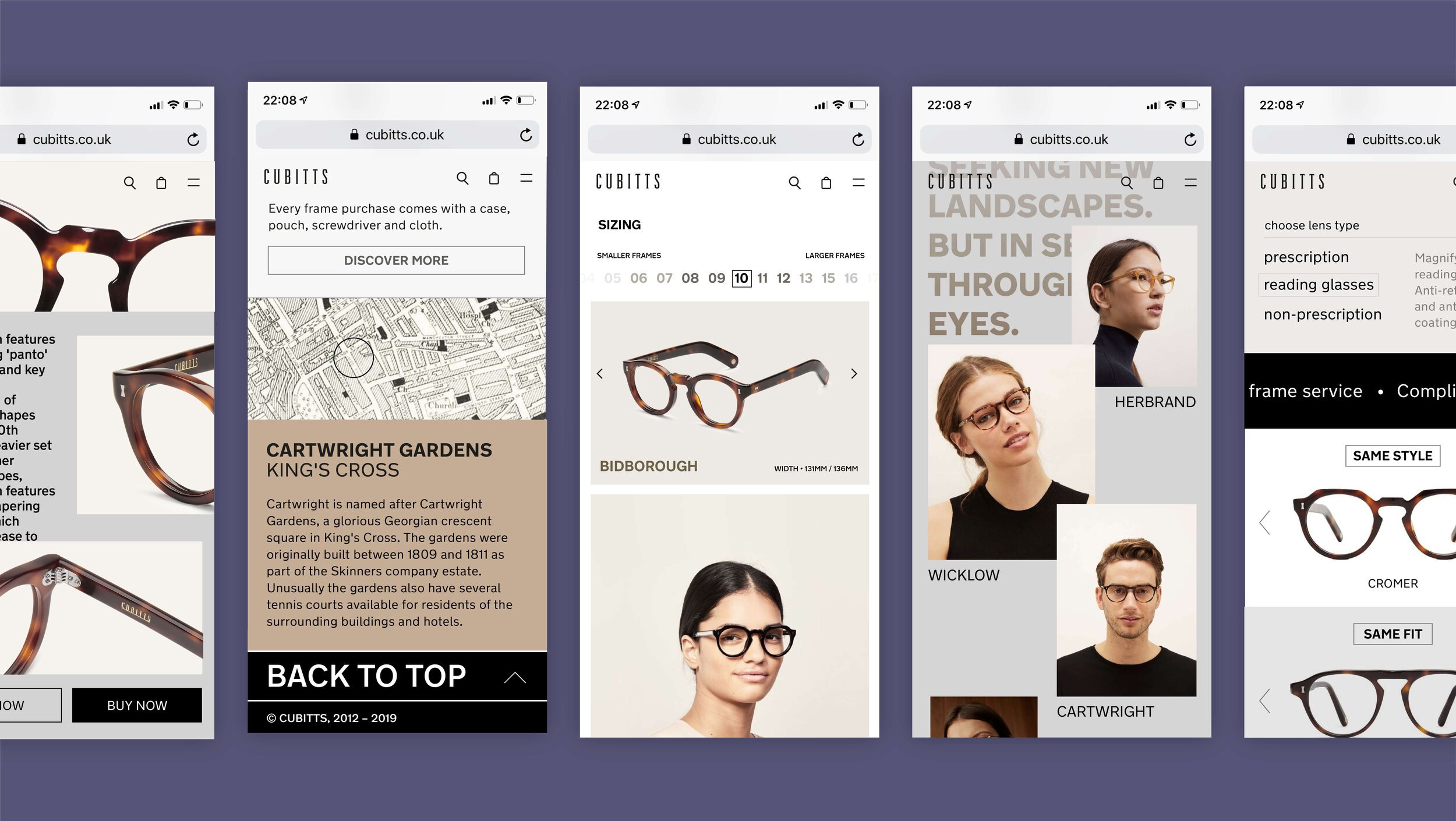
In 2019 we were selected to redesign the user interface of Cubitts website and propose a new direction that would elevate the holistic experience in spectacles e-commerce.


UX Process
Re-design goals
1. Mobile first
2. Page fold focus, all secondary information below the fold
3. Web accessibility (AA compliant)
4. More recommendations that would facilitate search
5. Easily accessible information
Desk Research
Competitor analysis and a market research was one of the first and important steps that would define the strengths and weaknesses of current and potential competitors. This step provided us with a strategic context so as to identify opportunities and threats.
Workshops
We ran a series of workshops including stakeholders from production and management fields (developers, market analyst, strategists, operations) in order to first understand the users, define their goals and pain points, research on the current user flow based on the exploration of the user and finally brainstorm on optimal user flows.
In order to do that we crafted the profile of the main user personas, documented potential user journeys and continued with cognitive walkthrough by defining the tasks that the user would be expected to carry out, eg. the research for customised spectacles.
Problems and pain points
Outcomes from the cognitive walkthrough research
CTA: we should make the available actions that a user can take to complete their goals salient enough, with proper UXW that is easy to understand
System responses: not enough visual feedback or cues between system responses and user actions / goals
Freedom in navigation: we should provide obvious ways to undo actions, unselect items, remove items and go back
Avoid cognitive overload: too many alternatives and repetition in information that is provided by the interface and interactions that are available from the system
Users
User definition
Users of all age, with prominence given to the younger and more modern audiences.
Also there should be an accessibility focal point for all users, since it’s a spectacles website.
User Personas workshop
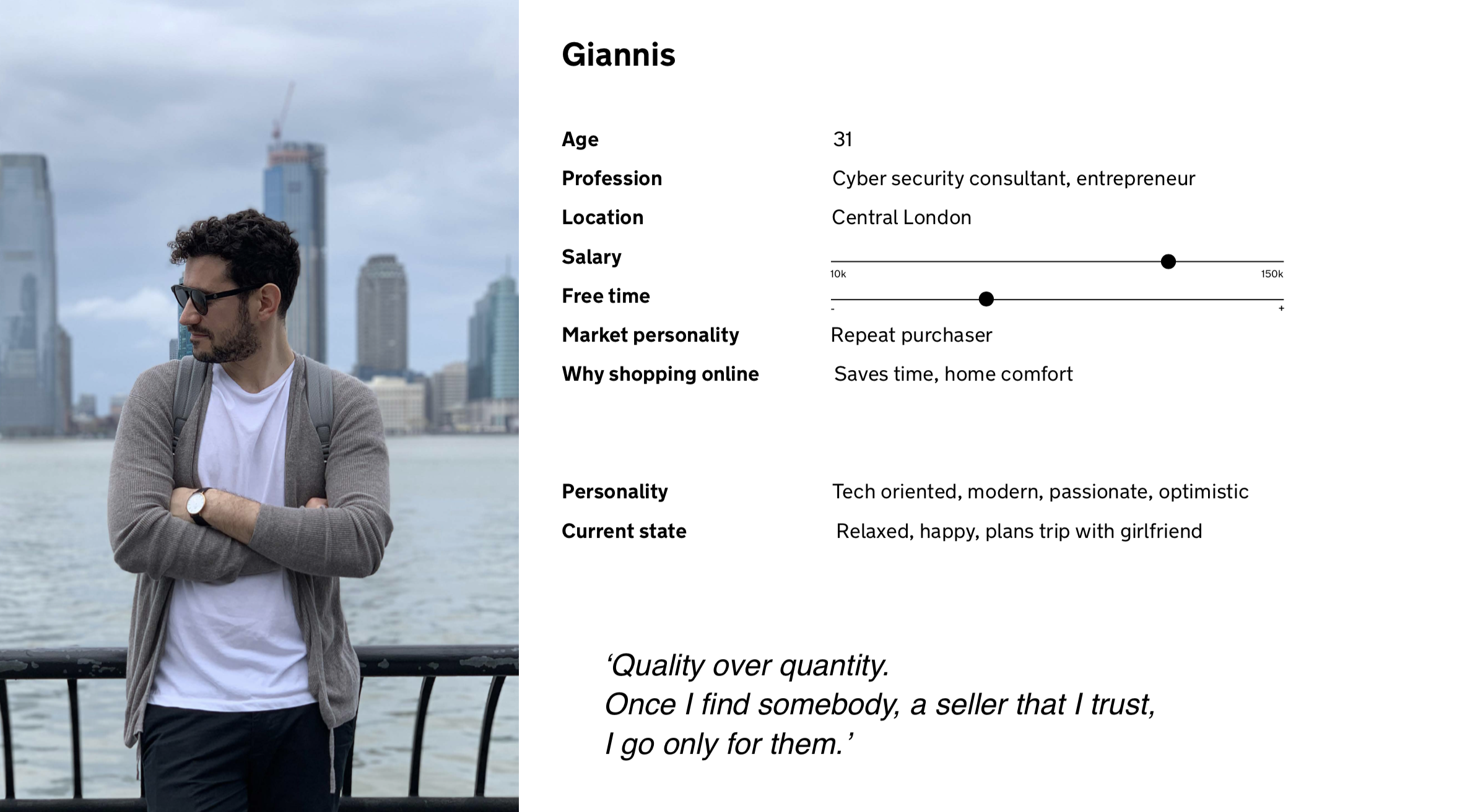
The user personas were inspired by using the collection of insights from the user interviews and focus groups. Four different personas were crafted during a meeting with the stakeholders:
Empathy mapping
In parallel empathy maps were built in order to take another glance into who our users are as a whole and help us prioritise their needs. This is an example of what a persona like David says, thinks, does and feels.
User Interviews and focus groups
I interviewed 15 people, trying to identify the needs of people who look for opticians and spectacles online. Apart from user interviews, a focus group also revealed interesting information about how users browse and navigate in the current online platform.
Usability test
Outcomes
50% of customers do not see content below the homepage banner
Only 32% of customers make it to the bottom of the spectacles page, missing key styles and content
On the product page, only 25% of customers see the sizing information
11% see model shots, and only 6% see product recommendations
Differentiation between mobile and desktop experience - Size information needs to be above the fold or clearly linked to - How do we get customers to see model photography and recommendations?
Key learnings
➊ Accessibility for all
The redesigned site now fully complies with WCAG 2.1 guidelines, making it accessible to users with various disabilities. Also user feedback indicated a significantly improved shopping experience, particularly in terms of ease of finding products and completing purchases.
➋ Importance of form factor
Importance was given to mobile-first designs; Optimising for mobile devices leads to increased traffic and sales from mobile users. The mobile version of the site was streamlined, resulting in a smoother and faster user experience on both smartphones and tablets.
➌ Simplicity and aesthetics
We learned from the redesign user testing that the revamped design simplicity and the clear and intuitive navigation reduced bounce rates and improved conversion rates by 38% ✨


