Cleo AI
Product design, Creative direction
Client: Cleo
Role: Product Design lead / UI designer / Illustrator
Team member: Lauren Newton
Year: 2021
Cleo is a financial assistant based on AI and machine learning, with a strong feministic voice, big sister vibes, lots of sassy quotes, humour, who roasts the user when they spend too much. Through chat, she provides the users with deep insight about their money, while suggesting personalised financial products that increase their ability to save.
Responsibilities
- UX design: Redesign strategy, workshops
- UI design: Visual tone of voice, Interface design
- Design system: Patterns, Components, Specs
- Creative direction: Illustration, Iconography
Problem statement
The need
On September 2020 Cleo’s brand went through a big redesign phase. I joined the team a month later when there was an immediate need for actions that would :
➊ bridge the gab between the new brand identity and the old product designs with new interfaces
➋ bring new and innovative visual concepts to life that correspond to Cleo’s funny and sassy tone of voice
➌ establish visual communication strategies that pass the vibe check of current and future users
➍ solidify the new product design via a robust design system.
Initial app state
App structure
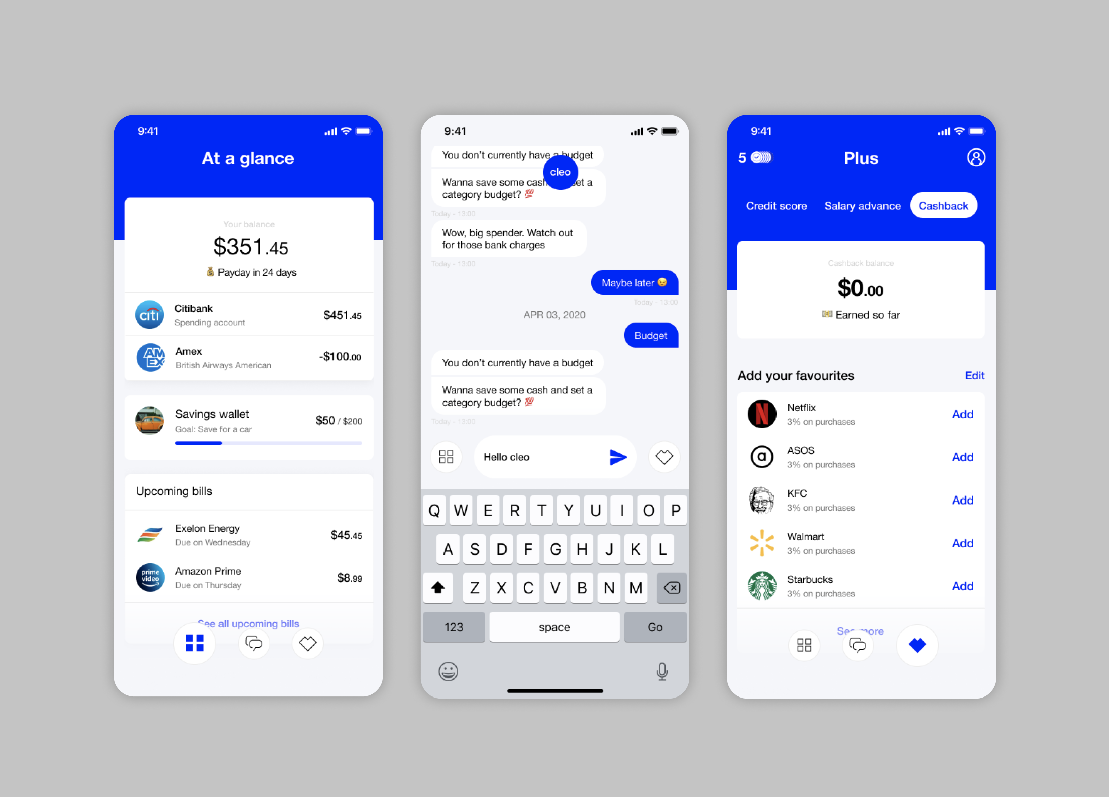
The app was initially comprised of 3 main tabs:
A. The dashboard on the left with information such as the available balance, the savings amount and upcoming bills
B. The chat in the central tab
C. The Cleo Plus on the right
Chat modes
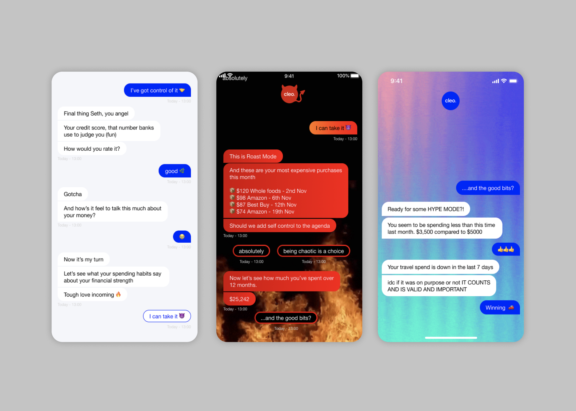
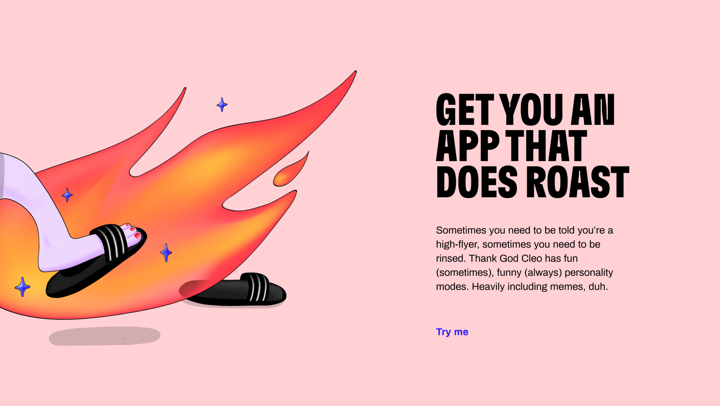
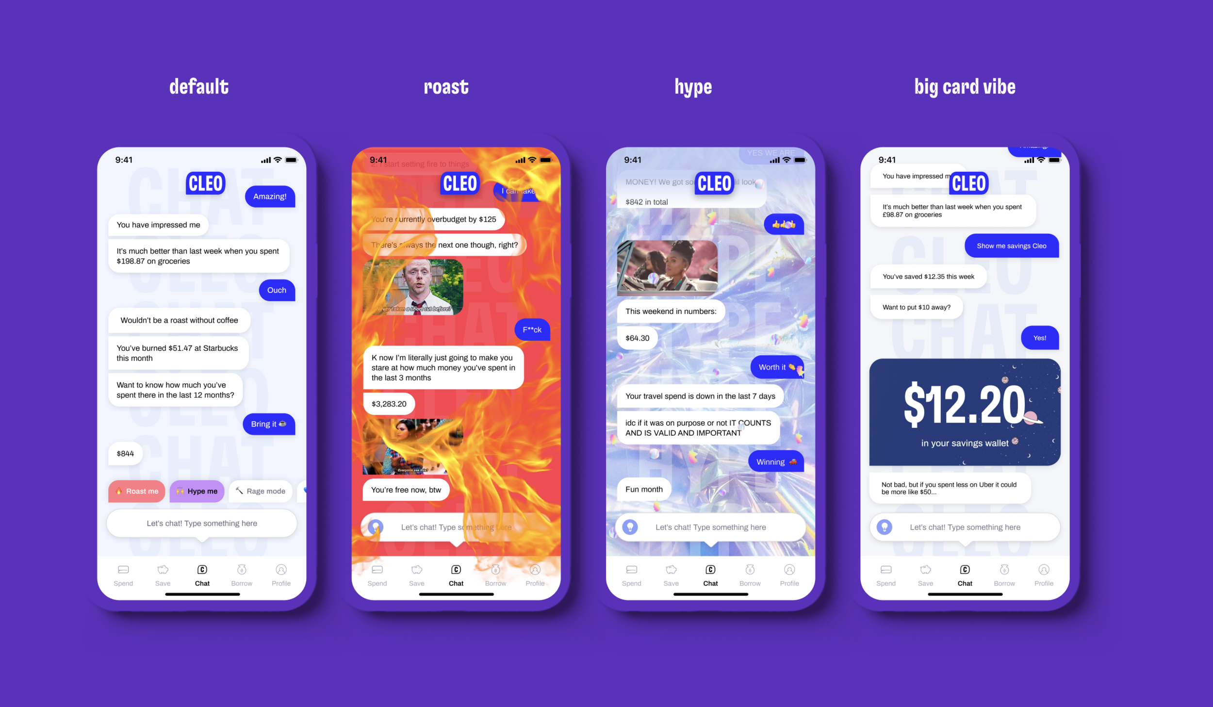
Apart from that, the most characteristic aspect of Cleo is her chat modes. Based on each mode, the chat colours and skin are transformed so Cleo can step in to motivate the users, roast them, hype them or even threaten them.
Design Process
S T E P 1
Understanding the product
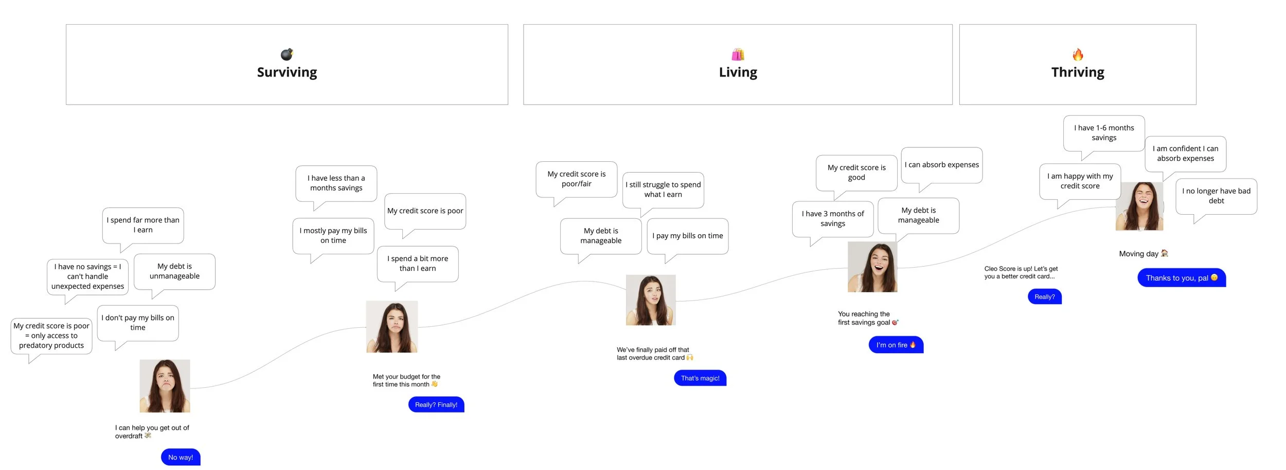
Users and journey mapping
Several workshops have been organised and also lots of research has been conducted by Cleo’s UXR team, in order to define the exact needs of Cleo’s specific user base. The majority of users are between 18-30 years old, live in the States, and part of them in the UK, and somehow struggle with their finances or find it very difficult to save money. They like chatting with friends, are very interested in a proactive way of saving and open to feedback and advice. Cleo’s audience is modern and active, has dreams and hopes, but it’s just unsure how to proceed to next steps in order to thrive. So Cleo is motivating her audience and users to take action and better their situation, no matter where they’re starting from, emitting big-sis, caring vibes.
S T E P 2
Ideation
Workshops and research
We started the re-design process with research and workshops, so as to establish Cleo’s first Visual Tone of Voice, the Design & Creative Principles and also to discover how potential new features would adapt to the product’s logic. This phase is really important as some of the steps are essential in order to set the ground for building the new user interface and the first design system of the platform.
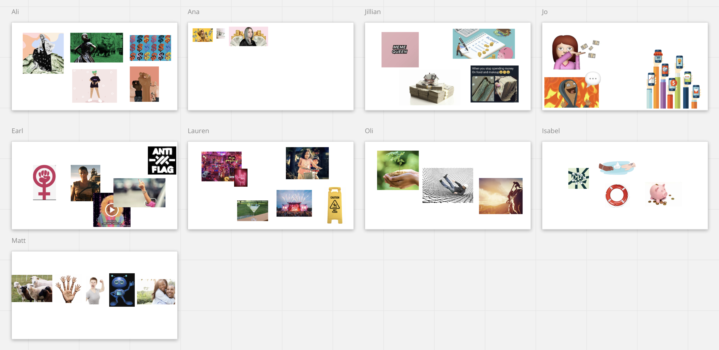
1. Aliens have landed
for unbiased inspiration
Brainstorming group activity to set the ground for the visual identity vibes, themes and aesthetics, based on the wider perception of our team.
Sooo, the story is to imagine that aliens have landed on Earth and they want to learn about Cleo. Since they don’t speak our language or understand the product, they can only communicate visually, with symbols or pictures. So I asked the team to submit 3-5 simple images or symbols that best describe what they think about Cleo, whatever comes into their mind.
This exercise can provide us with unbiased images and ideas about the true nature of the product.
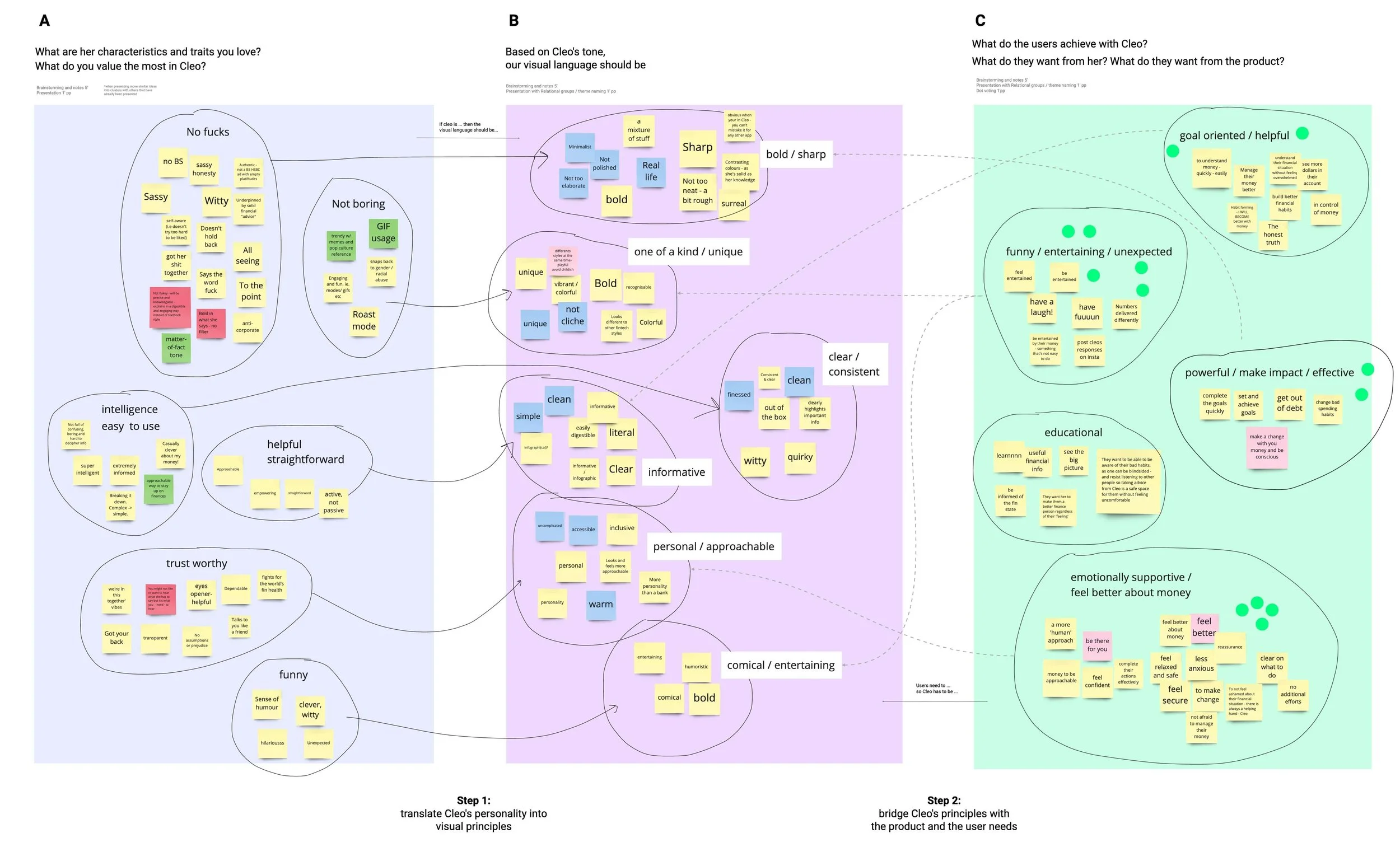
2. Cognitive mapping
for product’s tone of voice
This workshop has been very important since it was the key to configure the correct principles for Cleo’s visual tone of voice. These creative principles helped us define and structure the whole visual language of the product, such as illustrations, symbols and icons. There were 2 main research questions that participants tried to answer:
1. How to translate Cleo’s already established tone of voice into visual language rules
2. How to bridge these rules with the product and user needs
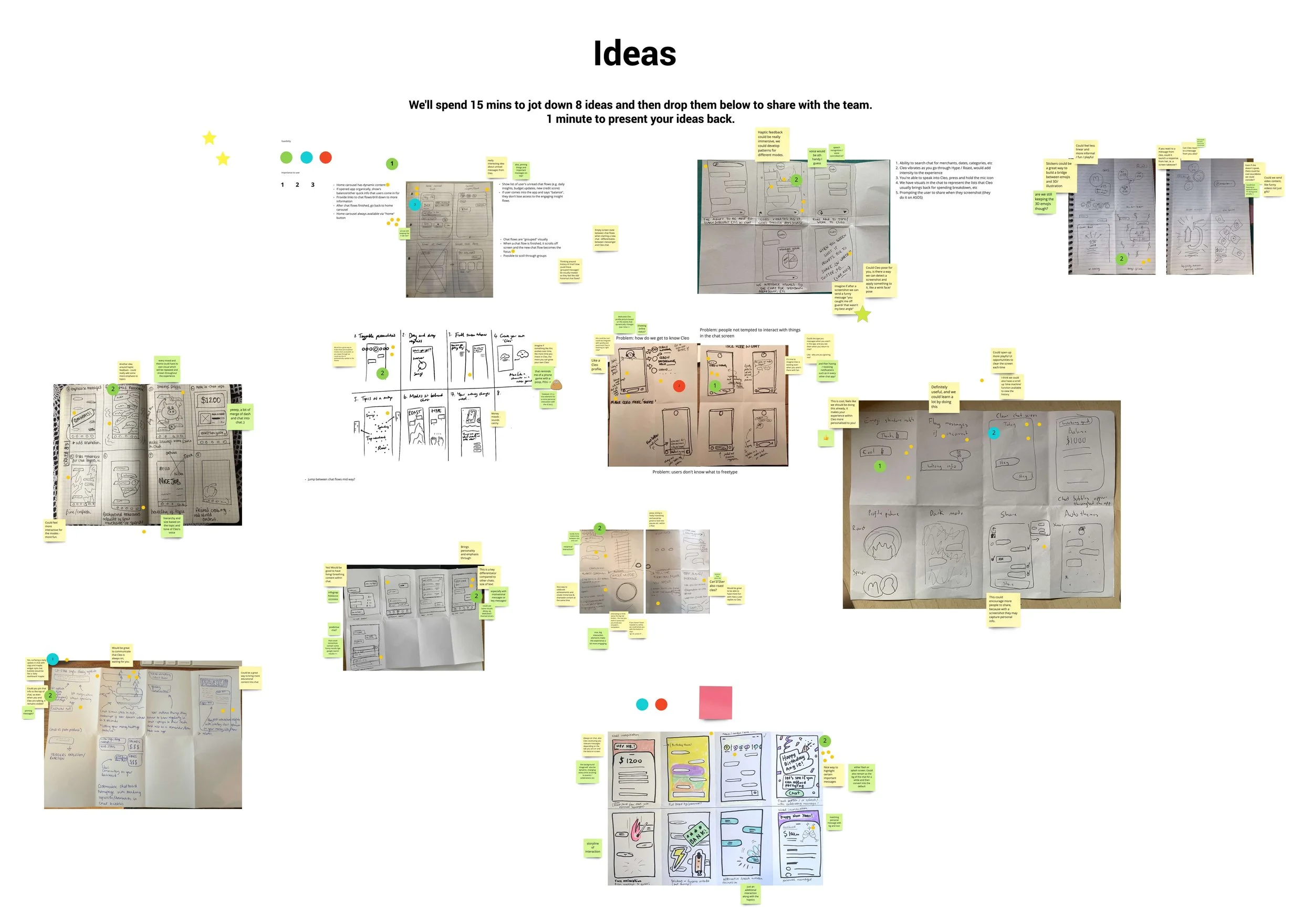
3. Crazy eights
brainstorming for Chat page
This workshop’s end goal was to ideate, research and finally propose solutions that could evolve the whole chat experience.
The main research question revolves around finding new ways to create a next generation of chat that can be more immersive and fun while at the same time it enhances and respects users’ financial wellbeing.
S T E P 3
Defining
After research, workshops and a lot of user testing, we figured out that a better user experience could be achieved with alterations in both the structure and the user interface of the app. So we started working towards a new app version that would cover better the needs of 5 million people.
Team: UX director, 2 user researchers, design lead
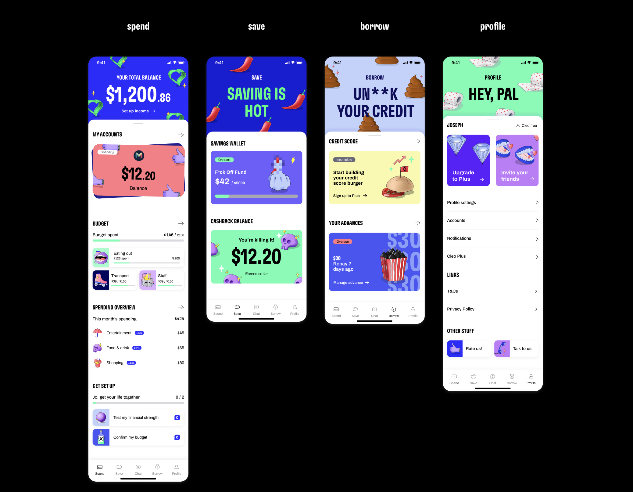
1. Five tab structure
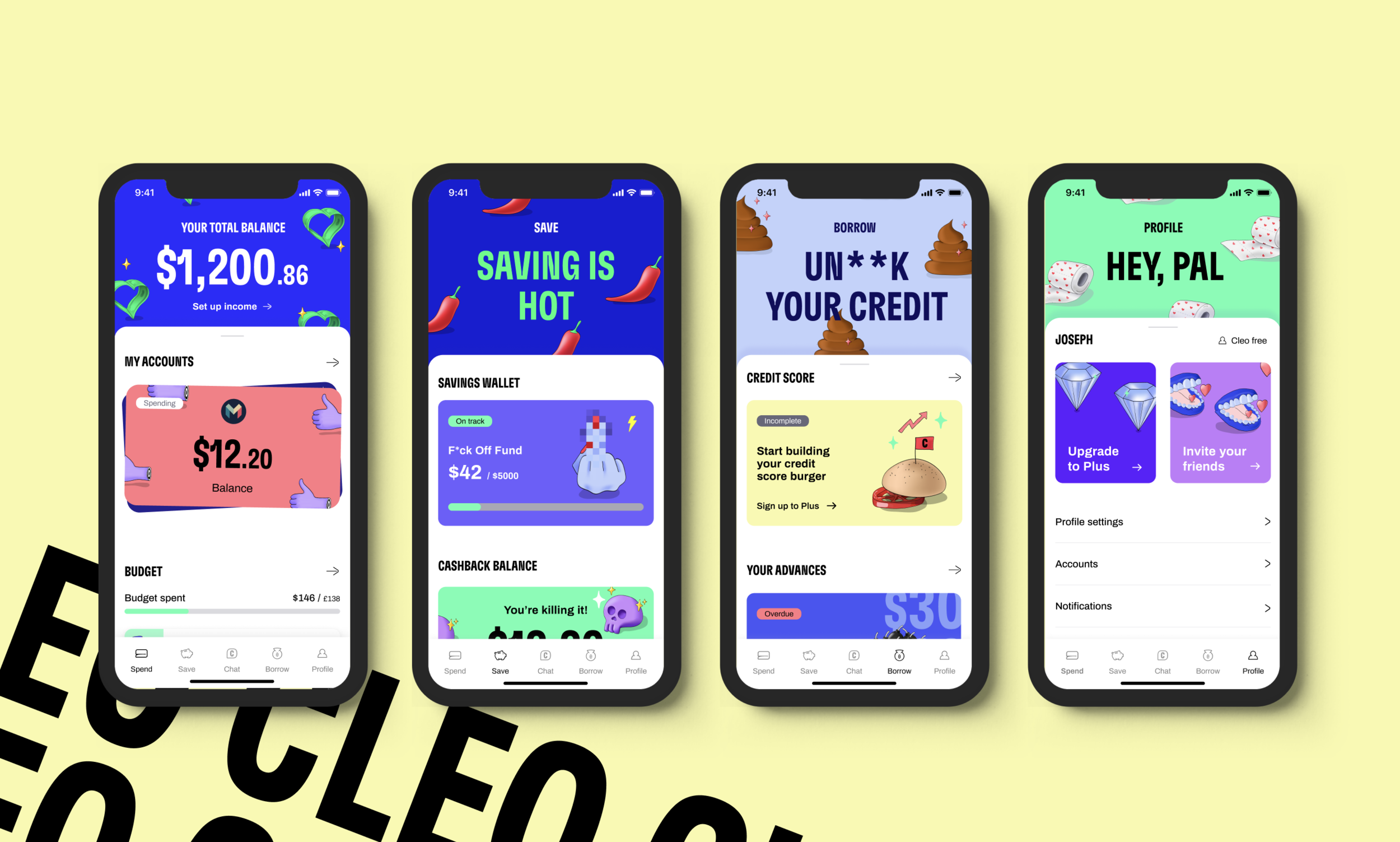
The new structure is based on a 5 tabs navigation, based on the most used and important tools that Cleo offers as a product, with chat in the middle always as the pivotal feature of the app.
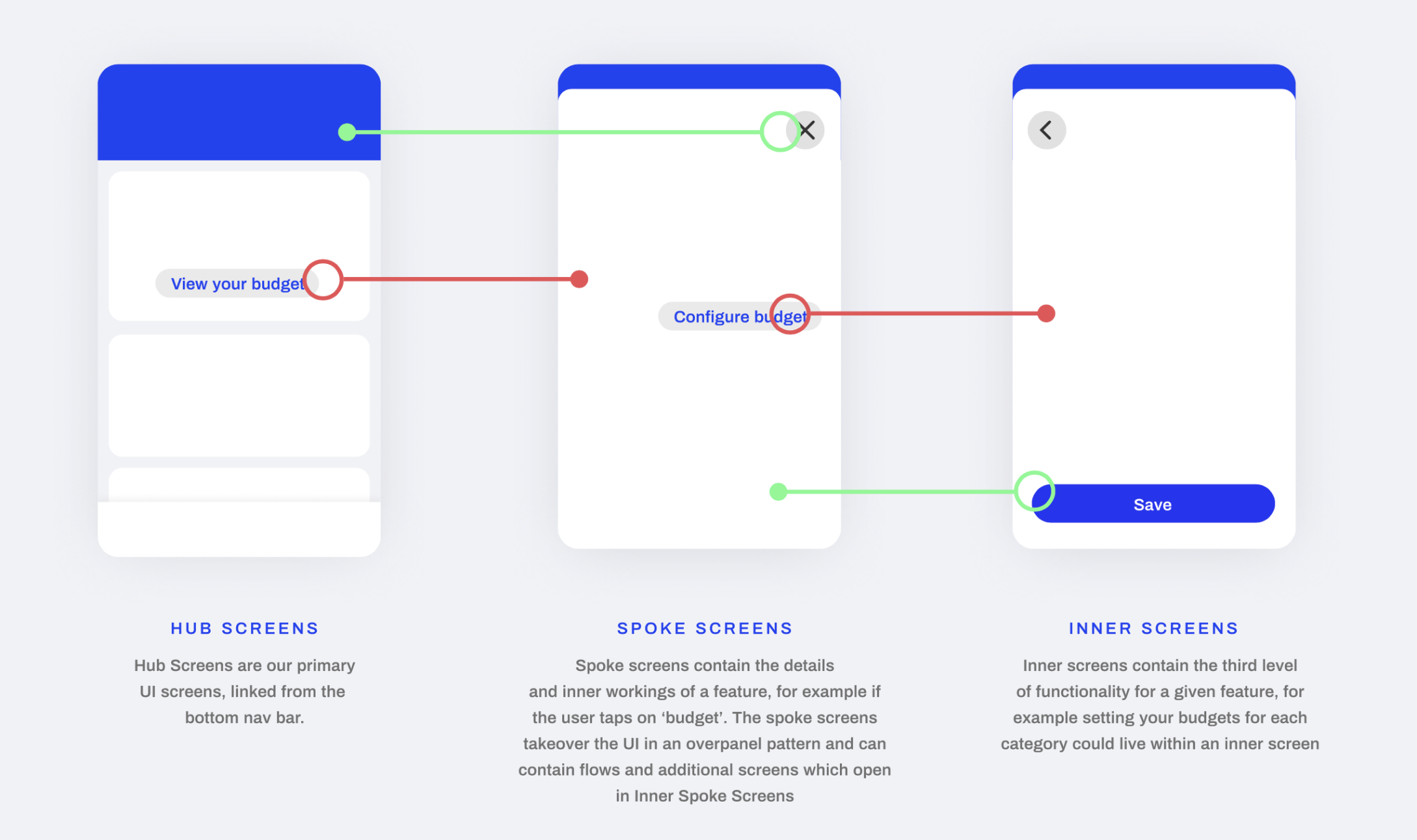
2. Three level navigation
A documentation of the navigation levels was also important, since it will help us decide about the visual prominence and the proper use of the various UI patterns and imagery elements.
Visual Language
Cleo works to change behaviour in spending and saving.
This new direction that we established, the new visual identity across the app, defined creative principles, tone of voice and UI - all support towards to delivering this mission. It enabled Cleo’s team to focus on doing things with BIG impact, creating a stand-out product, that supports all the users.
Creative principles
Rules for visual ToV
➊
BE FUN AND QUIRKY
Our users love having fun while being roasted because they made bad decisions about their money. Cleo is different. Her killer tone of voice is what makes her something unexpected and hilarious.
Our designs should reflect Cleo’s smart sense of humor, in a comical and witty way. In parallel, the visual tone of voice should be vibrant and playful, unique but also alternative, as herself.
➋
BE PERSONAL
Our users love to be emotionally supported and receive a more conversational and less transactional approach towards their money. In this way they feel relaxed, safe and positive about their financial processes. Cleo is a transparent and trustworthy personality, emitting ‘we’re in this together’ vibes, since she knows her ‘shit’.
Based on these characteristics and needs, our designs should feel more personal, reflect the real life and be approachable for everybody.
➌
BE BOLD
Our users need to feel powerful, set and achieve goals with Cleo and change habits effectively. Cleo is authentic and self-aware. She has her shit together, knows everything, doesn’t hold back and swears a lot.
With this in mind, our designs should be bold, sharp and solid. However, visuals shouldn’t be too polished and neat but rather more casual and friendly.


Illustrations
Cleo’s voice in visuals
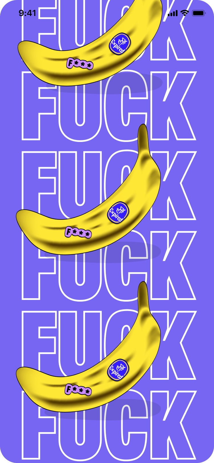
Illustrations play a pivotal role to Cleo’s personality, tone of voice and online presence. By following the established Creative Principles, our illustrations are quirky, funny and hironic. By being more handmade rather than polished or geometrical, the illustrations bring personality and emotion into the product.
This handmade visual outcome, emitting vibes of fun and empathy, can be used so as to differentiate Cleo from the rest of the existing fintech apps and maybe pave the way to bring more sense of humour into the financial world.
For more information see my case study here ➞
Icons
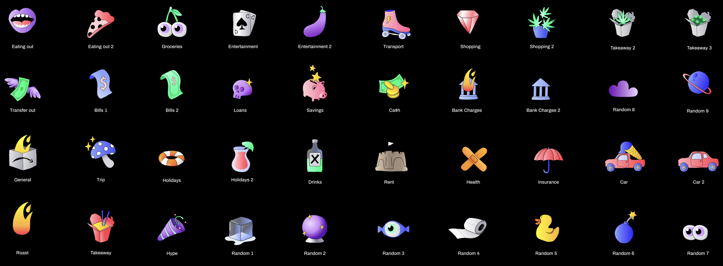
Cleo’s voice in emojis
The idea behind this collection is to create a library of ‘emojis’, under Cleo’s branding and tone of voice, so as to bring the chat experience closer to the brand, and similarly, the whole visual communication closer to a chat theme.
For more information see my case study here ➞
User interface
Based on the research we did, the defined visual tone of voice and creative principles, and also the new structure / information architecture of the app, we started creating the new user interfaces.
Iterations
Testing and feedback phase
We worked on several rounds of design iterations and user testing, in order to bring the final interface in life.
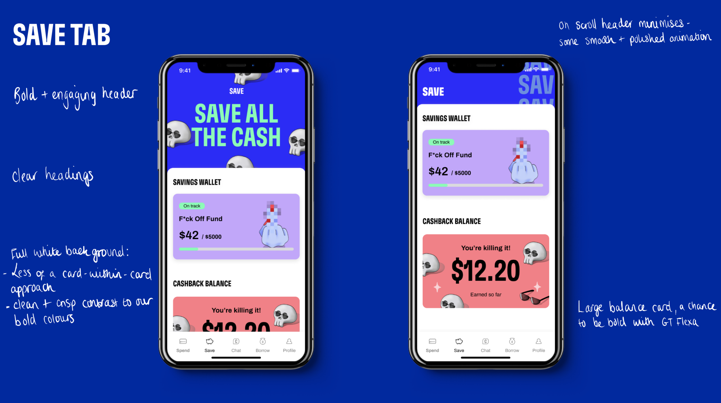


Final design
Core Tabs
Chat modes
Design system
Cleo’s first Design System is divided into four main categories, based on their purpose and use; Foundations, Components, Imagery and Patterns. It is a big amount of work so, for the purposes of this case study, I include a sample of it; the work around cards in a component level and some of the most important patterns.
Card Components
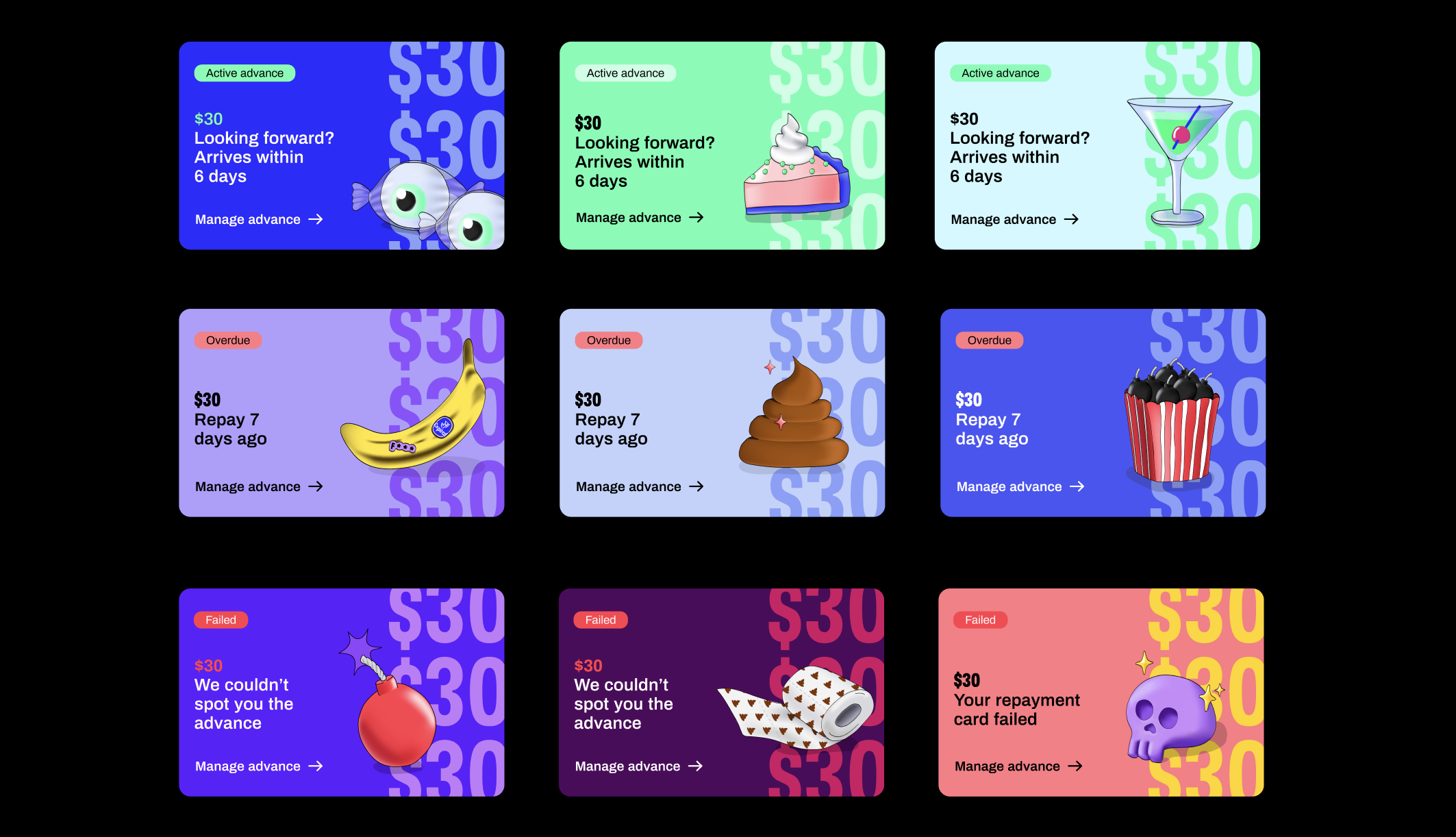
All the app pages are comprised of cards. These components are important as they establish the modularity of the app. They also exist in several forms, serving different informational needs.
Header
Balance card
Advance cards
CTA cards - Small
Categories cards - Small
Patterns
Super type screens
Cleo’s voice in type
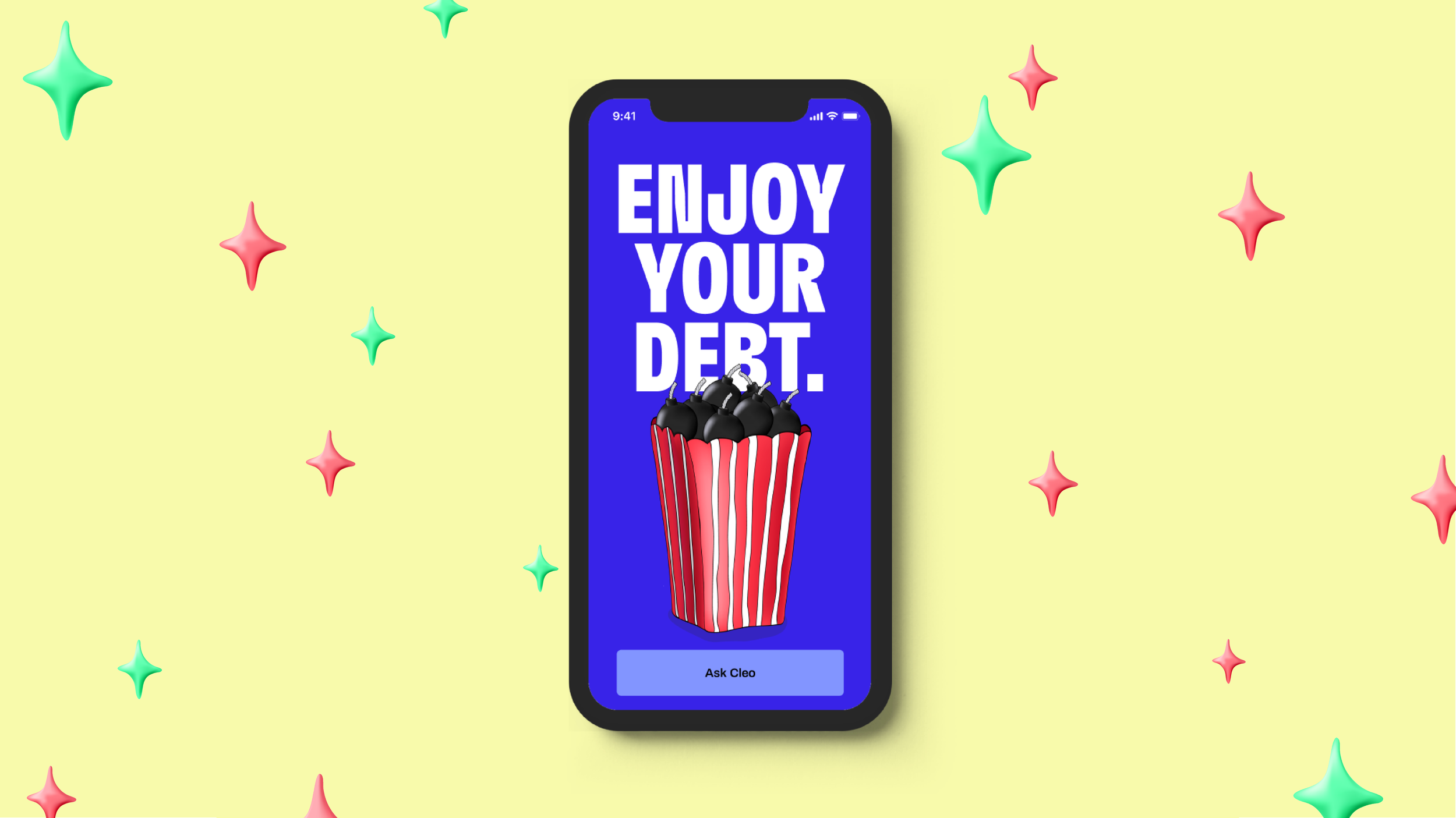
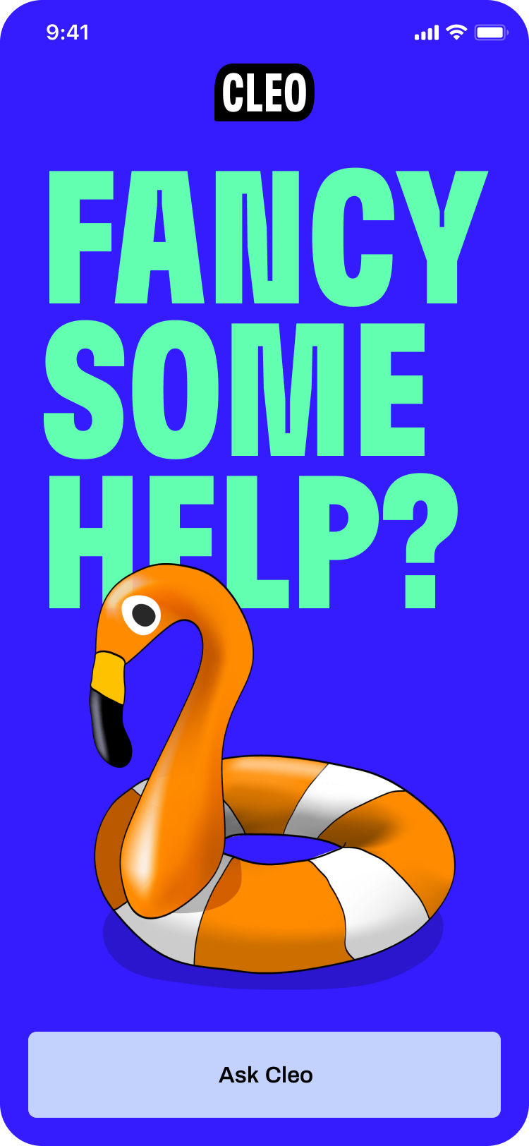
The ‘Super Type’ full screens is Cleo’s chance to reflect properly her identity and visual tone of voice through the app.
And I’m super proud as an illustrator that we pushed it to production!
Super Type Screen component could be used throughout the app as:
A. Full screen modal windows (dialogs)
B. Onboarding screens
C. Feedback screens (eg. success)
D. Splash screens


Linear stories
Consecutive illustration logic
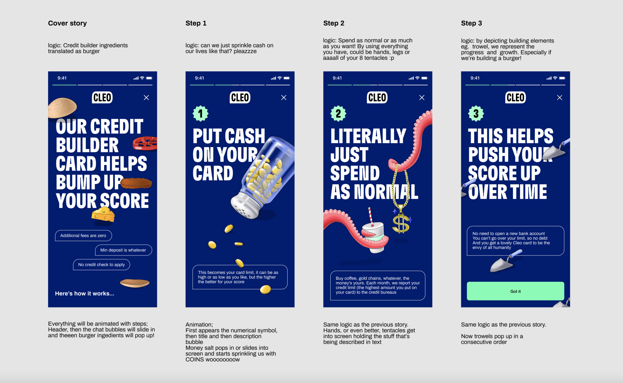
Apart from the core UI flows, we also reviewed the way that social media mental models could work for our case. Based on the positive feedback got, we established an in-app-stories concept, via which users can be informed about anything new, in a modern and fun way.
The in-app stories span across 4 levels, follow a specific storyline or narrative and contain animated visuals that illustrate this sequence or consecutive path. For these linear stories, there should always be a main cover screen with call to action and for the rest steps, a repetitive symbol that indicates the sequence.
Visual example:
Key outcomes
➊ 1M+ more installs
We managed to reach more users, boost Cleo’s social media presence and actually create an adaptable product for the social media era; the holistic redesign of the online presence reflects Cleo’s product design values and her humorous and fierce personality
➋ Easier to understand and interact with Credit score
Boosted Adoption with Dynamic visual language within product design, digestible infographics for our GenZ audience and with a new, killer tone of voice as differentiator
➌ Boost core retention and increase conversion to Cleo+
After the new UX strategy, information architecture and redesign, we achieved a more informative, easy and painless onboarding.
The improvements of ease of use within the core product experience also led to NPS growth.
