Cleo
Art direction, Illustration, Visual Communication
Client: Cleo
Role: Design lead, Creative direction, Illustrations
Year: 2021
Cleo is a financial assistant based on AI and machine learning, with a strong feministic voice, big sister vibes, lots of sassy quotes, humour, who roasts the user when they spend too much. Through chat, she provides the users with deep insight about their money, while suggesting personalised financial products that increase their ability to save.
My main responsibility had been to bridge the gab between the new brand identity and the old product designs, find innovative ideas for visual communication through product and build the first design system.
Illustrations
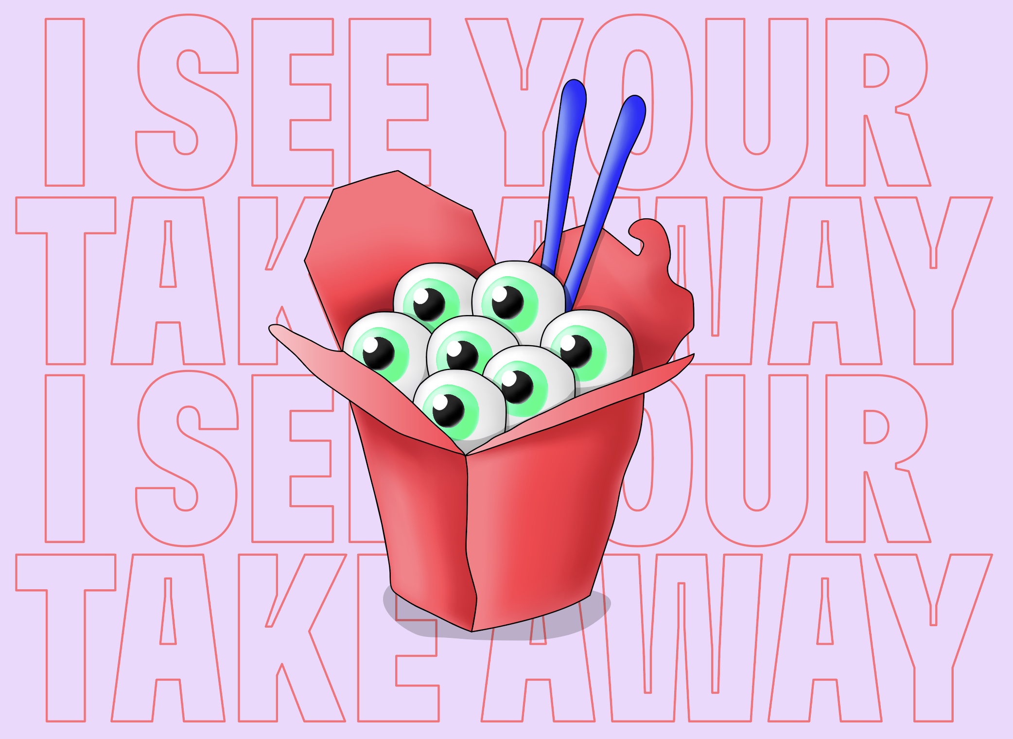
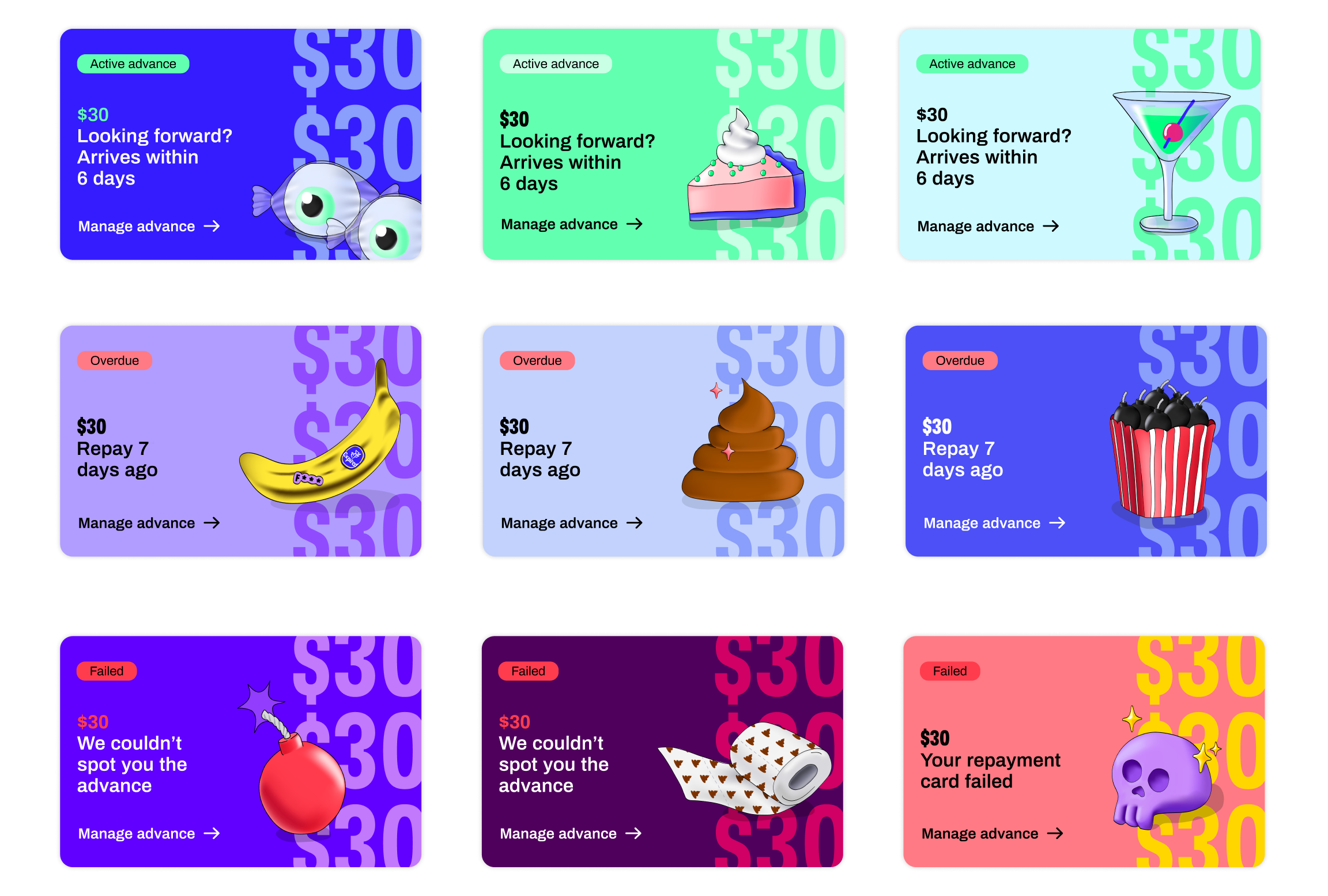
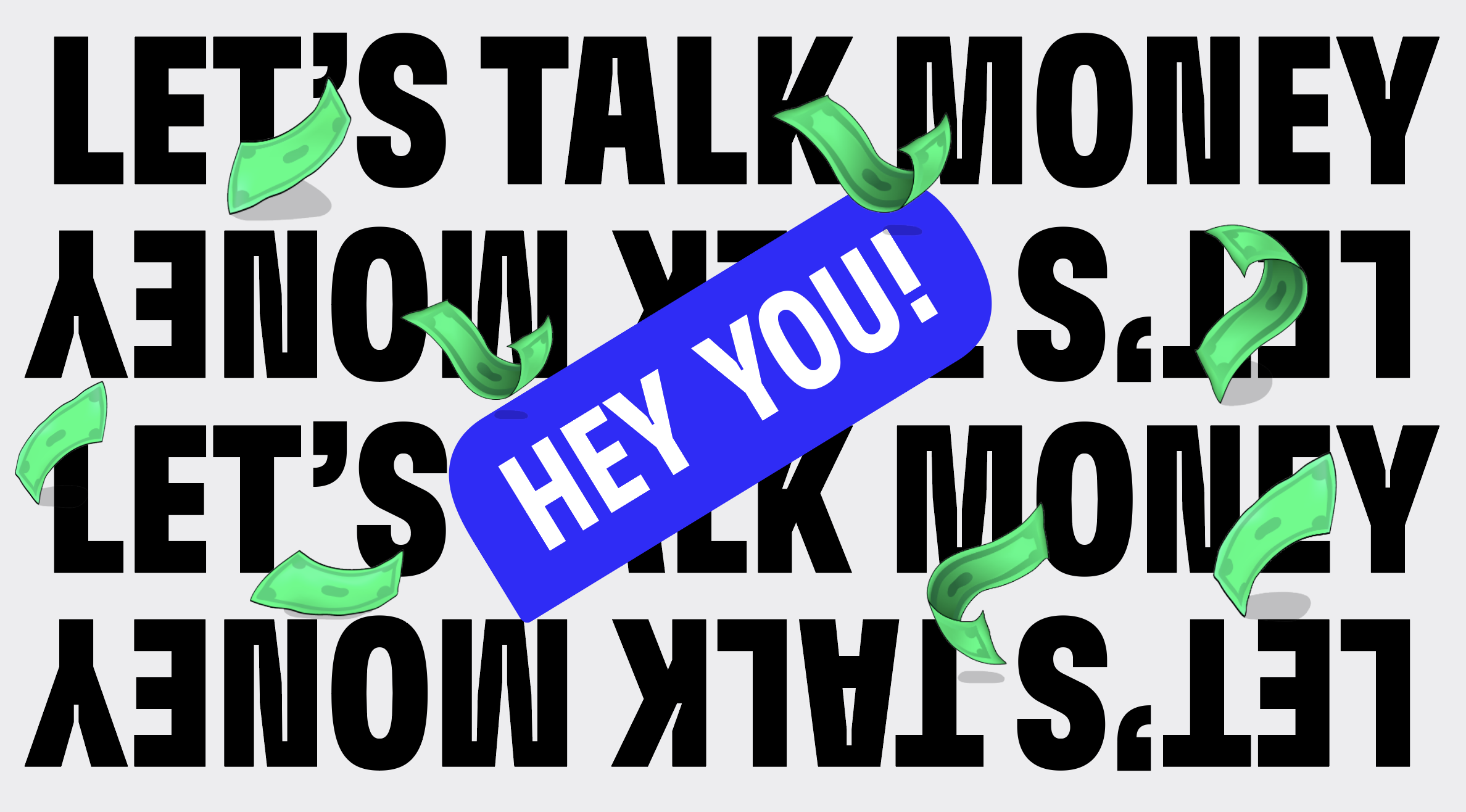
Illustrations play a pivotal role to Cleo’s personality, tone of voice and online presence. By following the established Creative Principles, Cleo’s illustrations are quirky, funny and ironic. By being more handmade rather than polished or geometrical, the illustrations bring personality and emotion into the product.
This handmade visual outcome, emitting vibes of fun and empathy, can be used so as to differentiate Cleo from the rest of the existing fintech apps and maybe pave the way to bring more sense of humour into the financial world.
Illustration library
The idea behind an illustrative collection is to create a library of ‘emojis’, uder Cleo’s branding and tone of voice, so as to bring the chat experience closer to the brand, and similarly, the whole visual communication closer to a chat theme. Here are some examples:
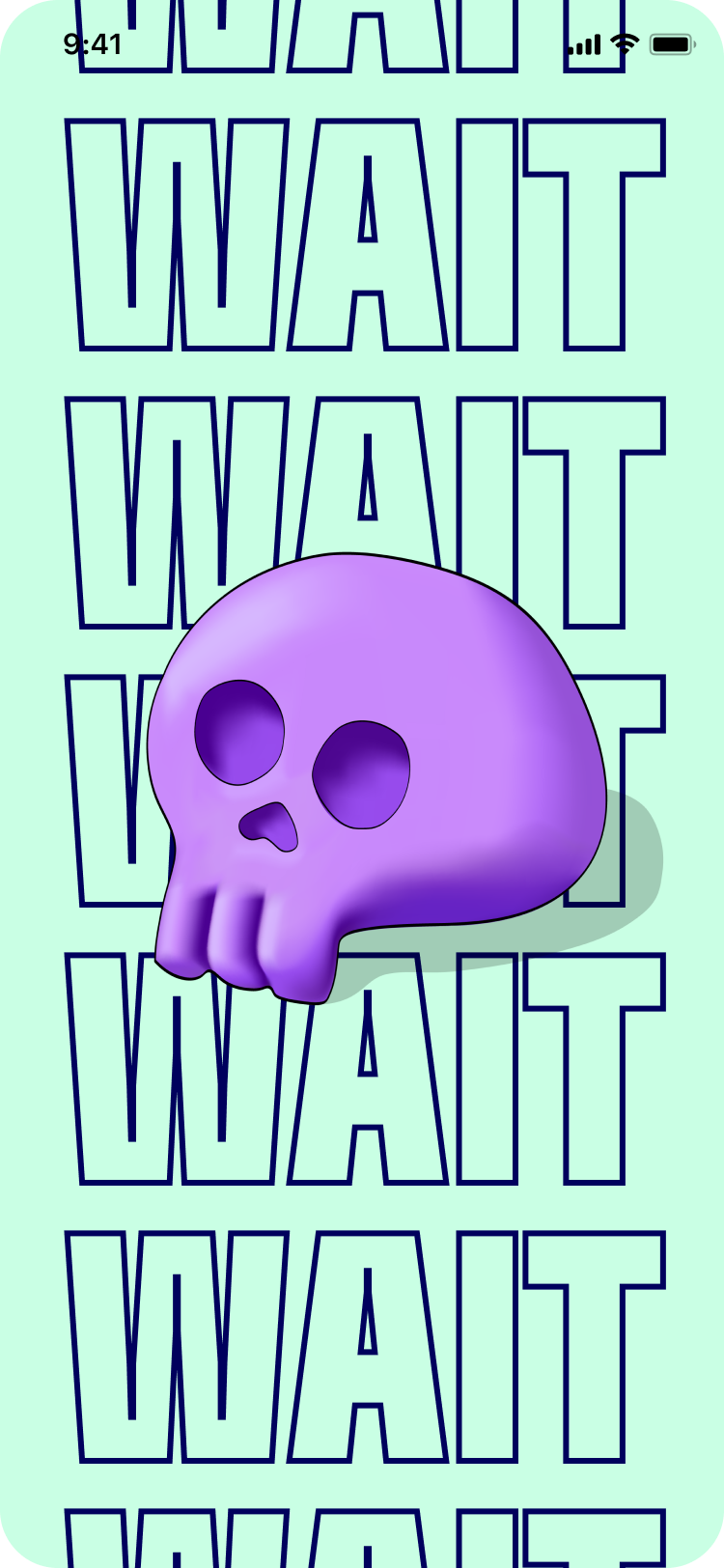
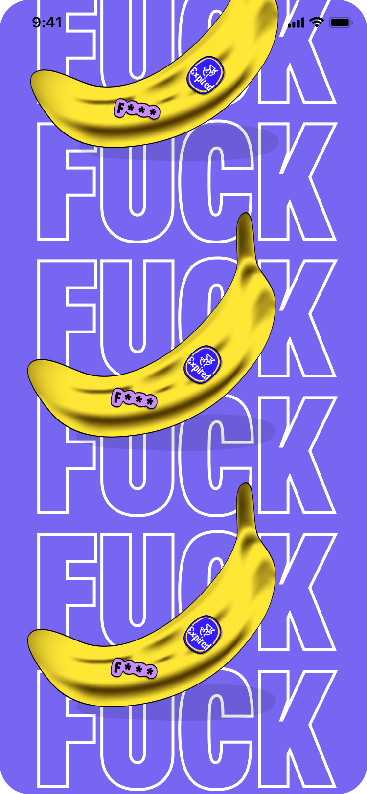
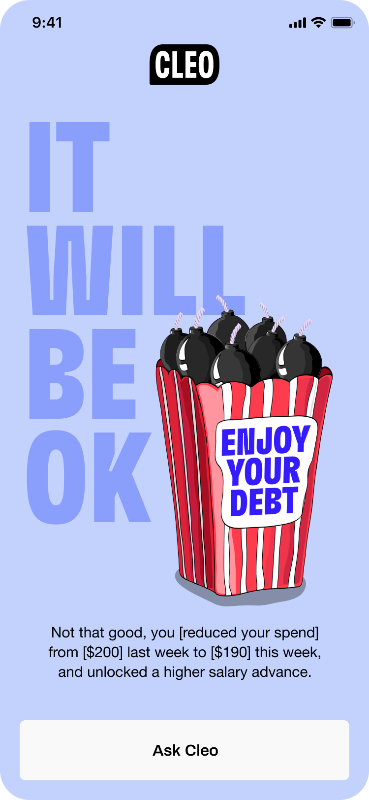
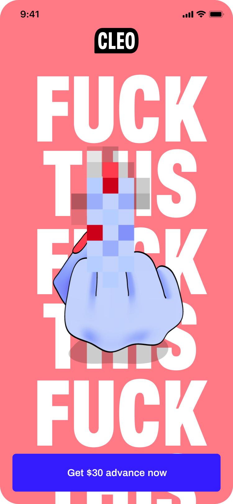
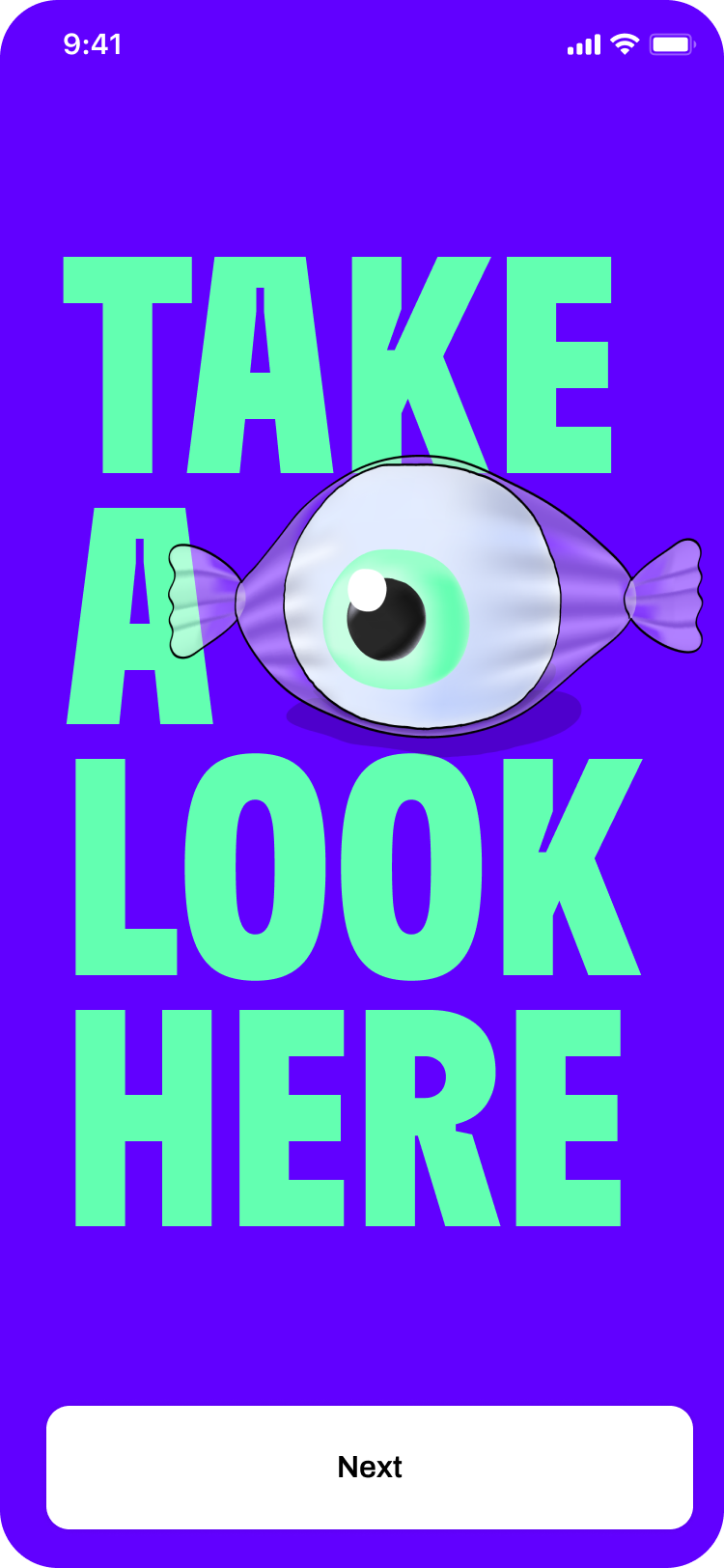
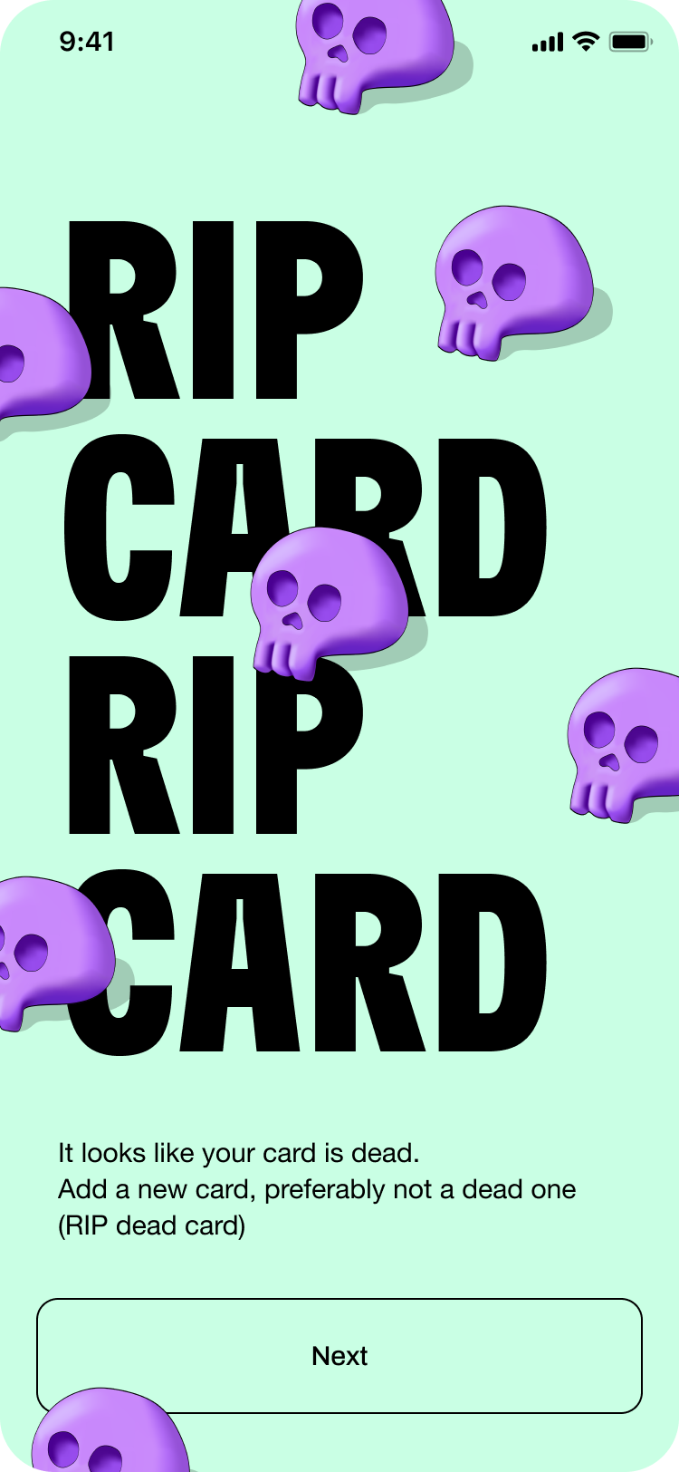
Supertype in-app screens
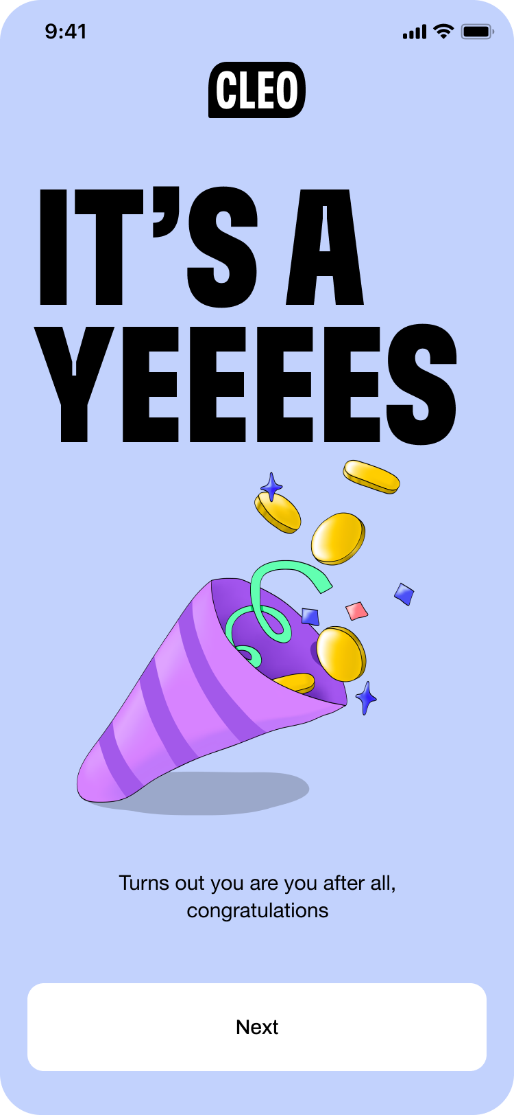
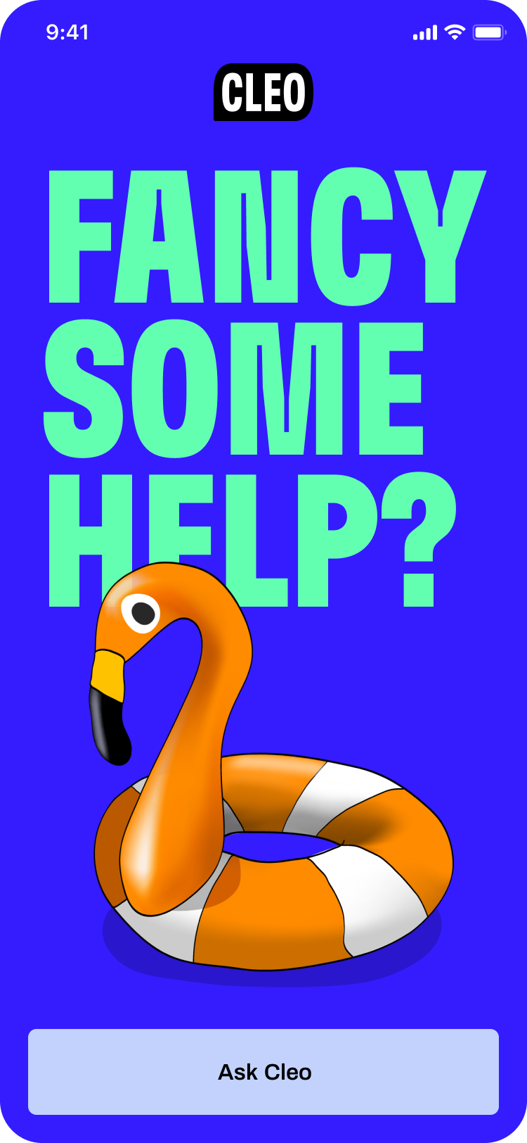
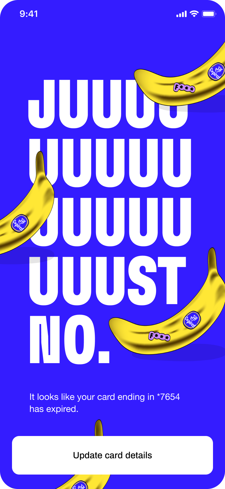
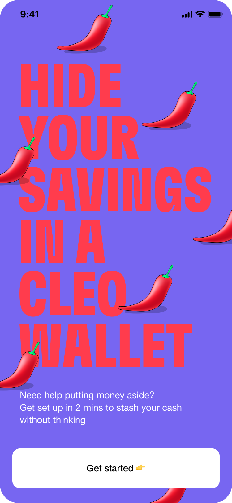
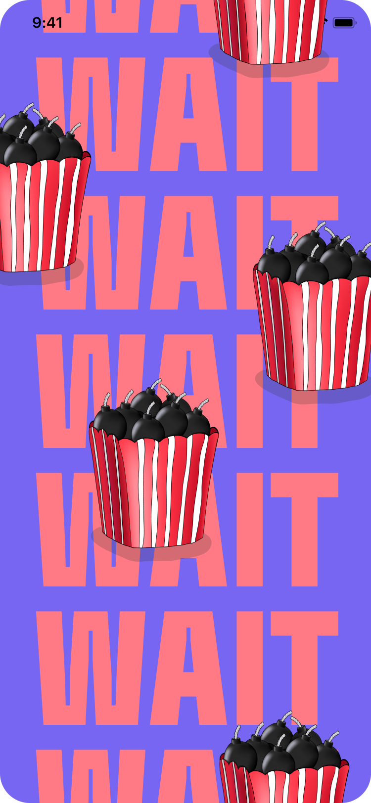
The ‘Super Type’ full screens is our chance to reflect properly Cleo’s indentity and visual tone of voice through the app.
Super Type screens are being used as:
A. Full screen modal windows (dialogs) B. Onboarding screens C. Feedback screens (eg. success) D. Splash screens
